


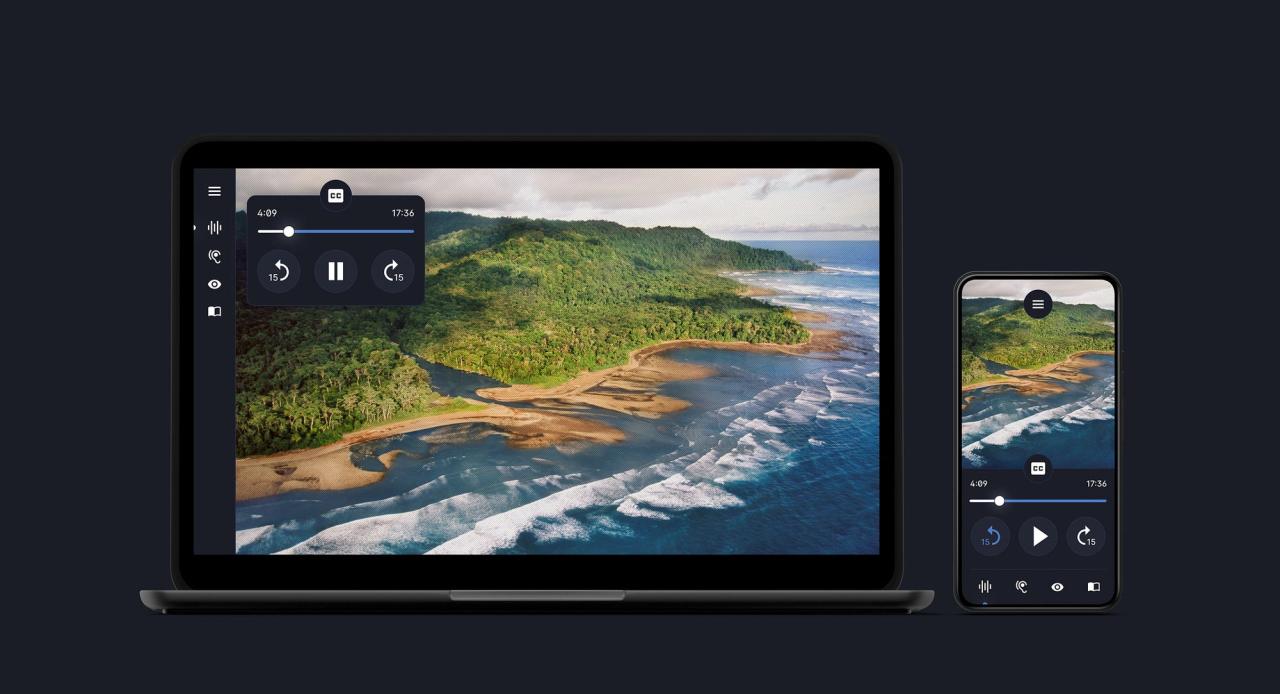
One of the tools in the suite was designed let users switch from a standard reading experience to a lean back, audio-led one, so that they could elect to have the stories spoken to them with accompanying visuals. It was this feature that Google decided they wanted to run with as the core experience. So we focused on creating a new kind of audio first, storytelling platform.
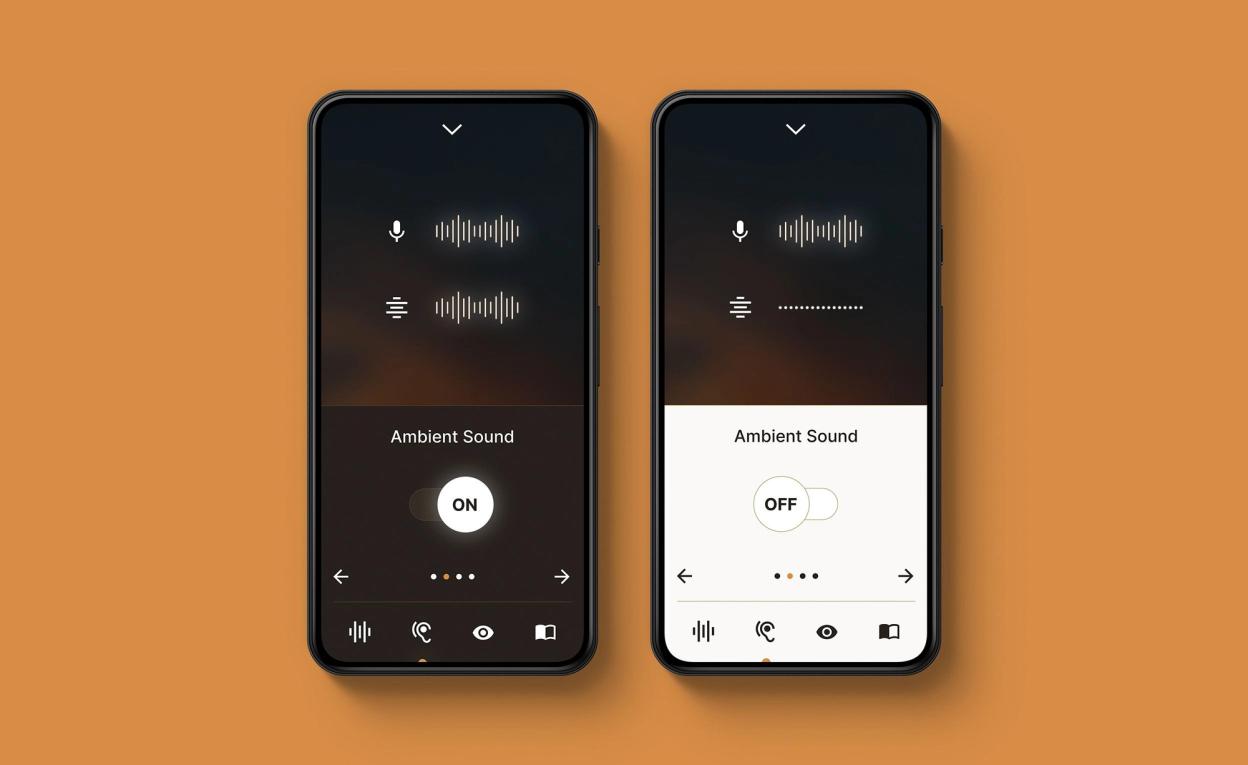
The new aim was to design an experience that could be enhanced over time to become a platform that anyone could create stories for regardless of their budget or recourses. You should just need a set of media assets and a microphone to record the v/o. The system would do the rest. It would be a system that could use keywords and map locations to generate ambient soundtracks and pull in imagery if needed.


“I got so much more information than reading through a regular news article, where usually I can't tell what the images or content are in the way that the writer of the article intended.”
“I felt like I was truly immersed in the story. The spatial audio design was impeccable and actually thought someone was in my house at one point. The granularity of audio and visual control was truly exceptional. There really is no comparison to a regular news article or podcast.”
“Having the story told in this form was so much nicer than having to listen to my screen reader ramble through it.”
“This was easier to access than anything on a traditional news website or app. This actually gave me control over my experience.”
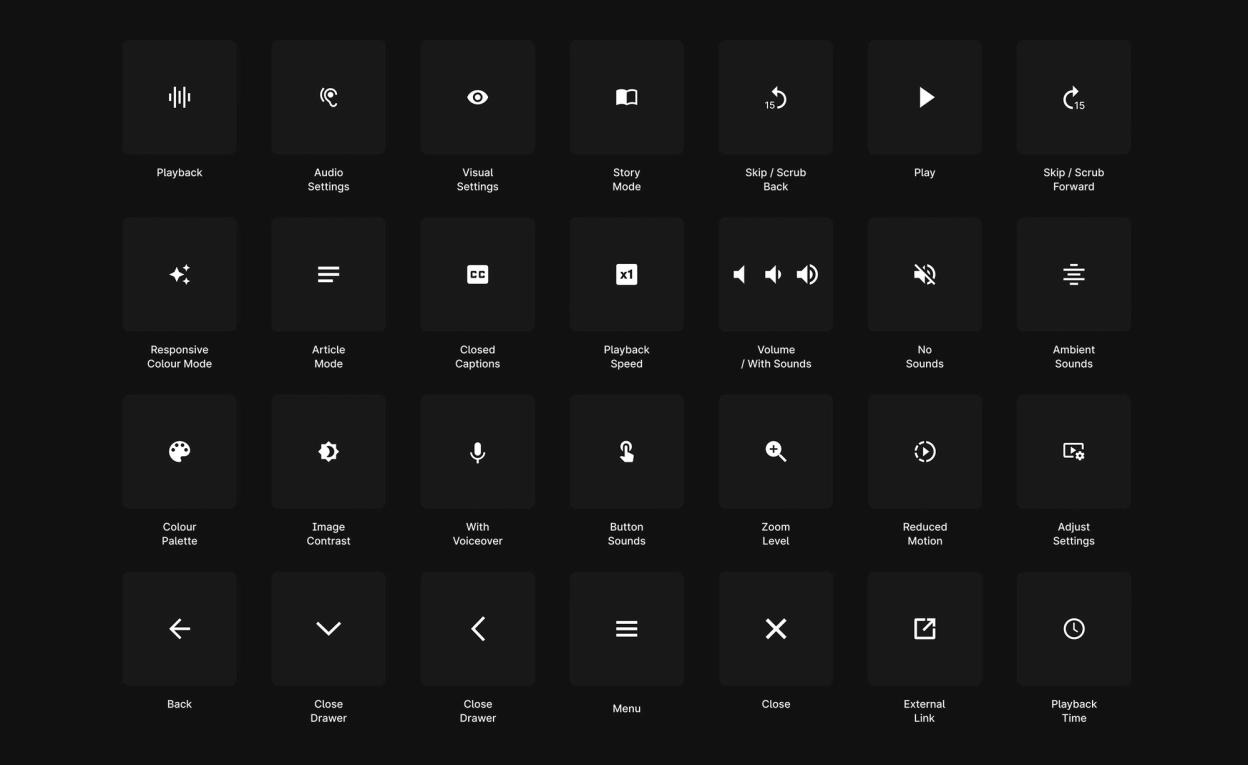
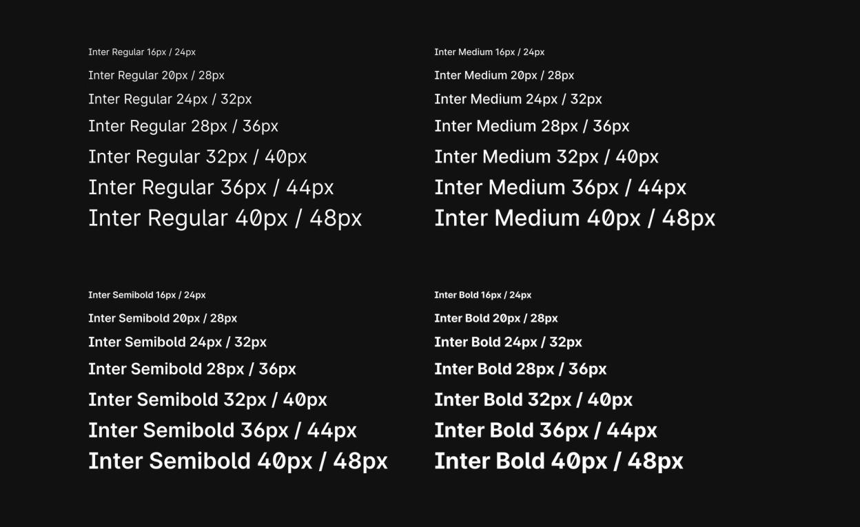
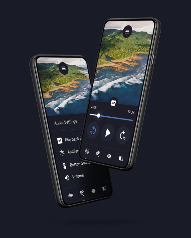
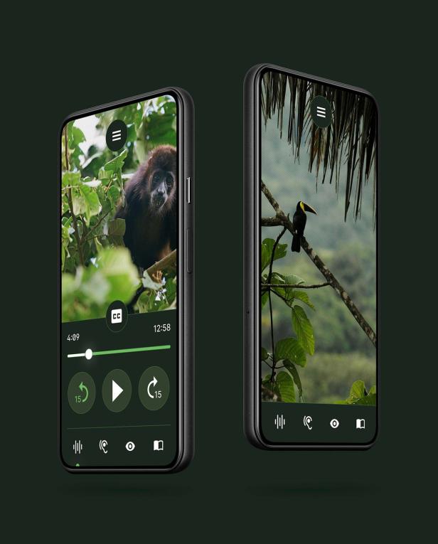
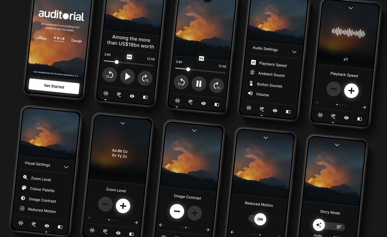
The platform is designed to allow users to quickly set things up to suit their visual abilities, press play and let the story unfold. It was be designed from the bottom up with the blind and visually impaired as the target audience, so text size, buttons, colours etc are all highly accessible.
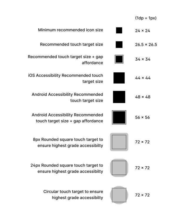
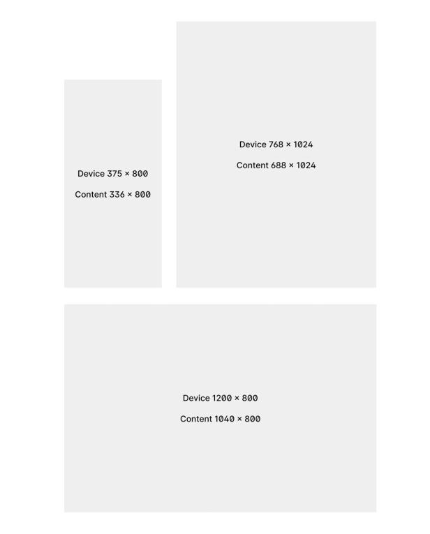
We kept the UI patterns down to a minimum in order to ensure familiarity, and set ourselves the task of ensuring all UI was located within a single small zone in larger breakpoints so visually impaired users — who tend to zoom in heavily — don't get lost looking for buttons. The site had also been optimised and stressed tested for screen readers. We worked weekly with our panels of blind and visually impaired testers to ensure everything was fully validated through the process.