


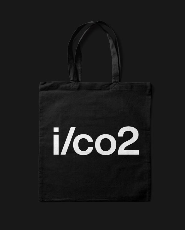


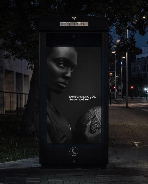

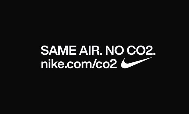

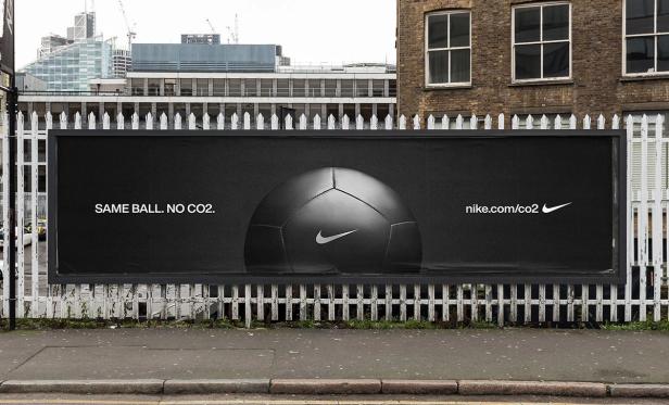

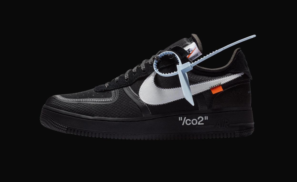
Companies such as Nike would be encouraged to use the /co2 mark in campaigns and products that tie in to the overall visual language, while still having their own design DNA as part of

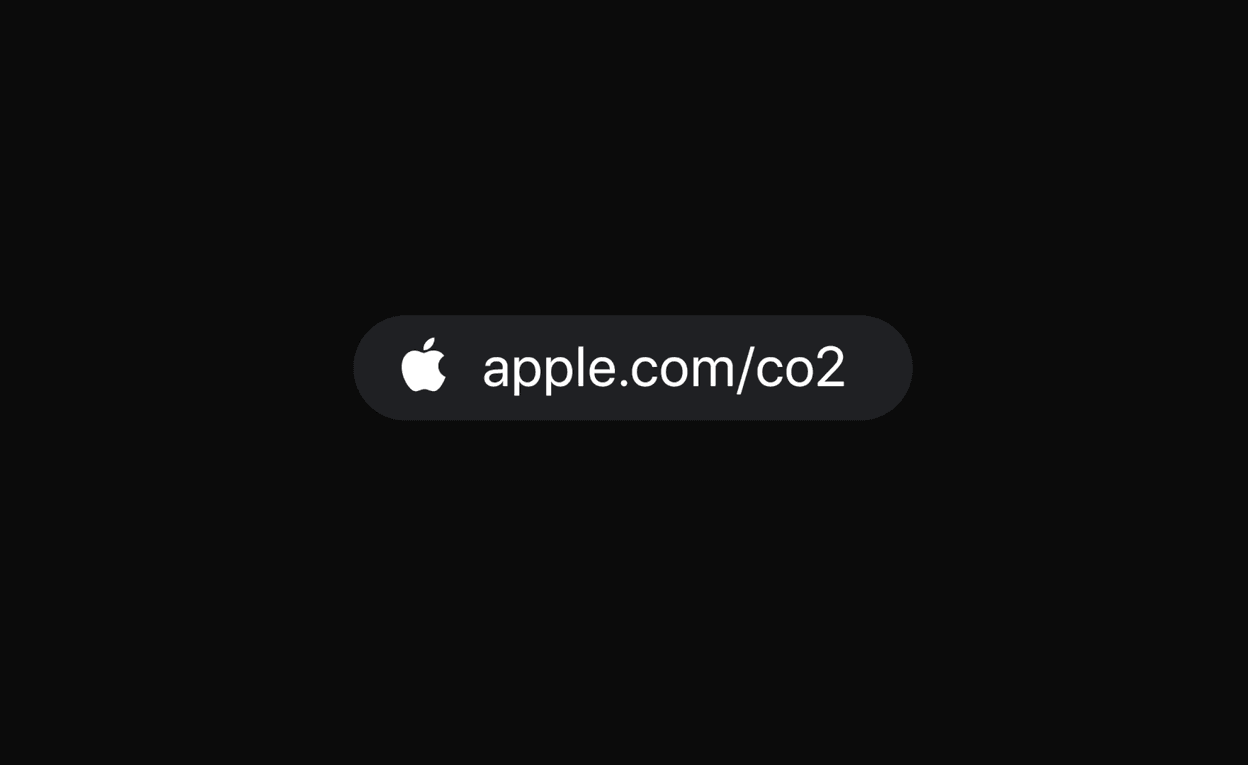

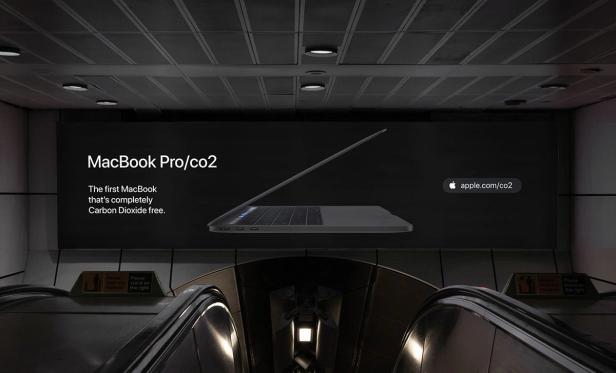

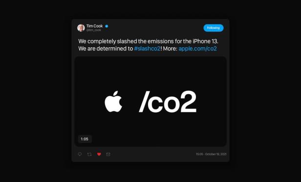

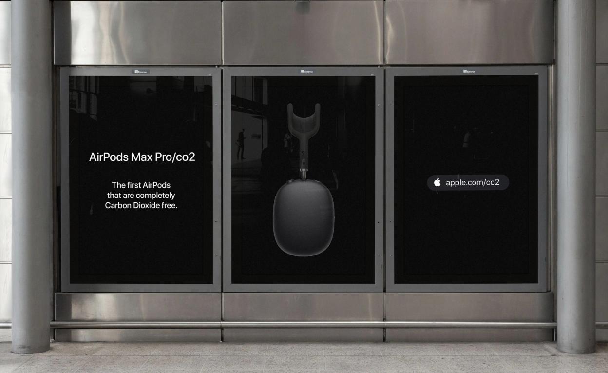

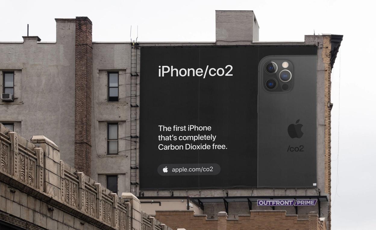
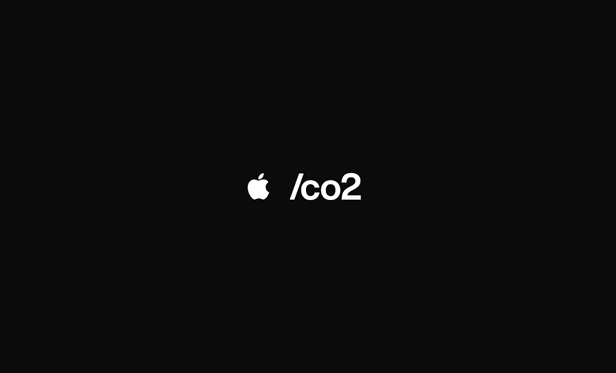
These mockups show how companies like Apple could seamlessly pull in the /co2 campaign message into their own tone of voice style

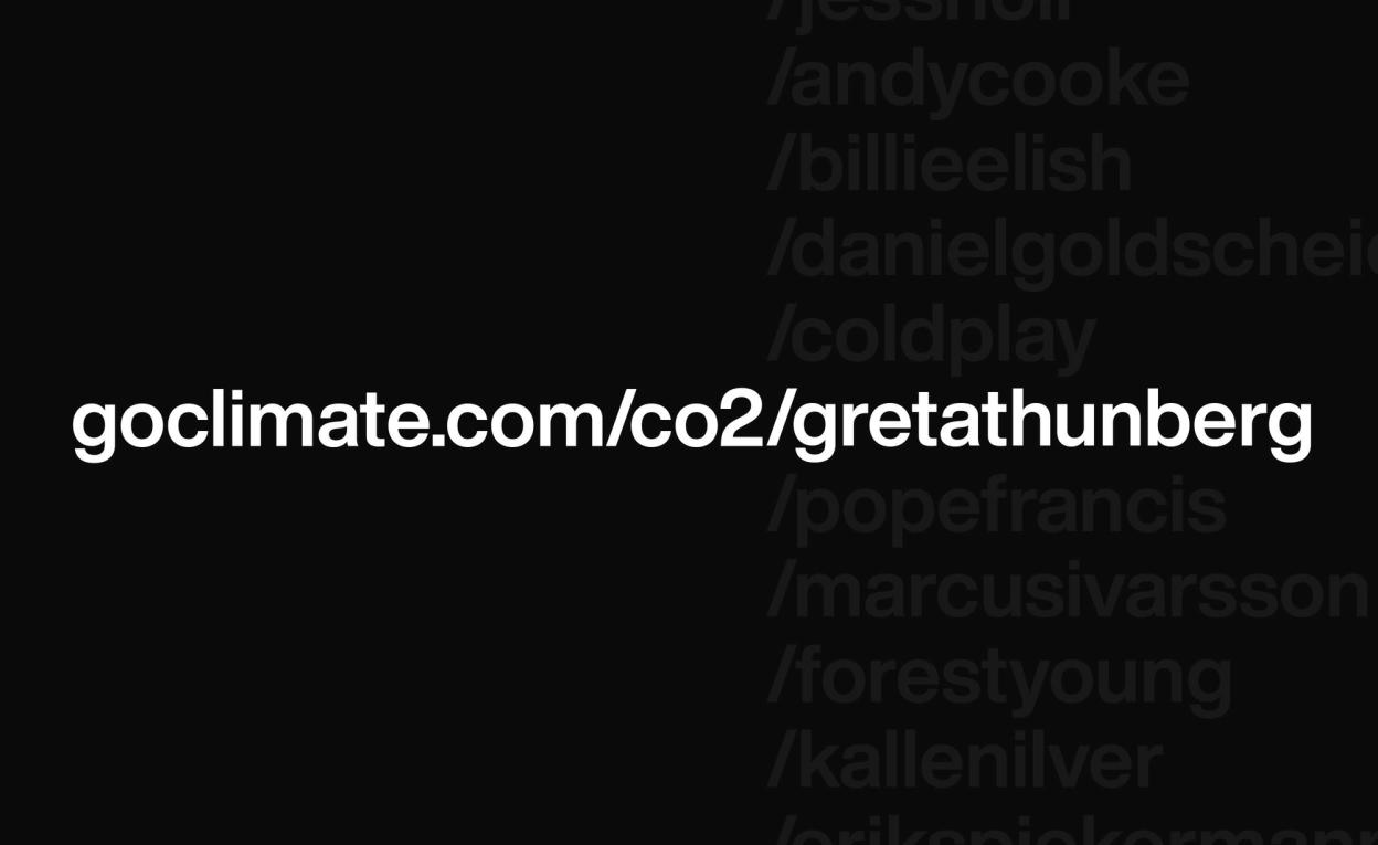

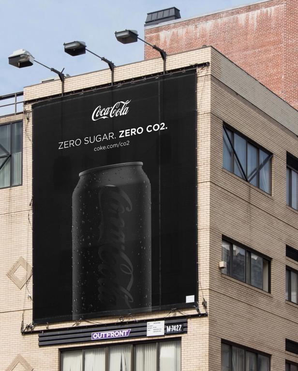

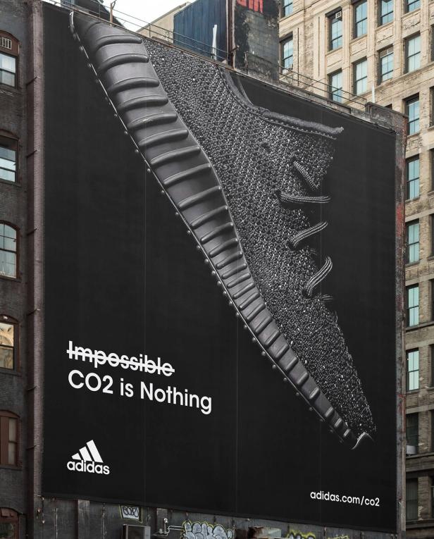
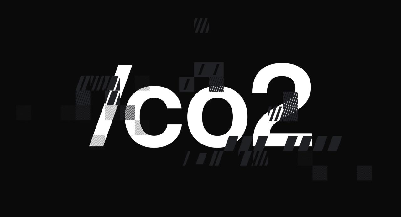
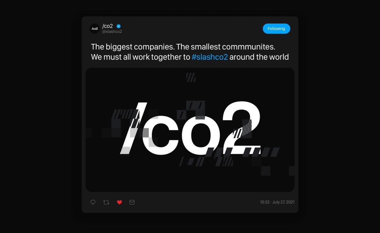
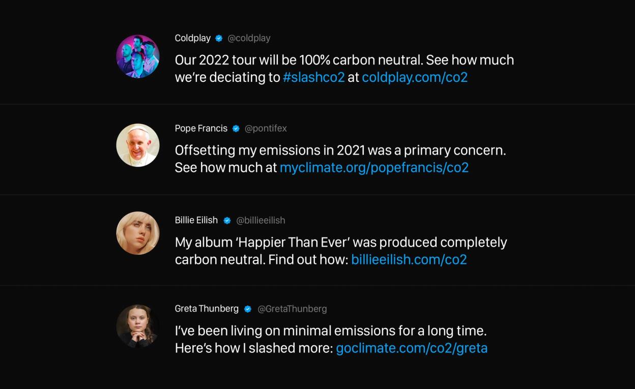
The campaign look and feel that follows a blackout visual language is easily replicable across company’s own product lines and advertising styles