


The drinks are centralised in everything the brand does, and it’s the number one touchpoint to consumers as an introduction to the brand, along with the goal after any kind of brand immersion.
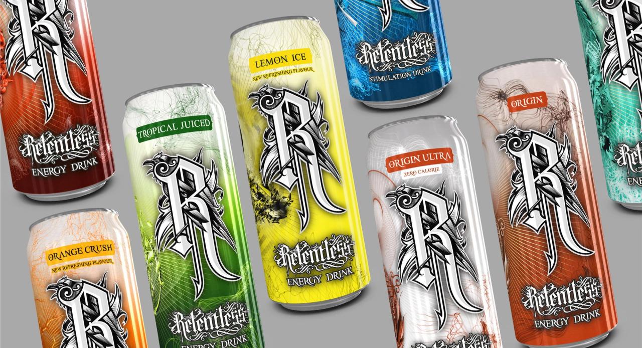
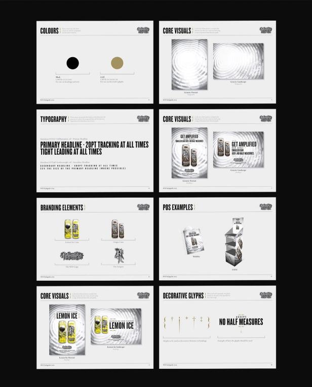
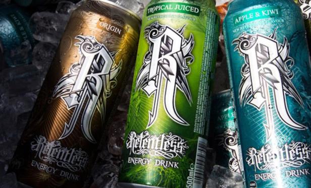
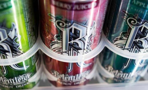
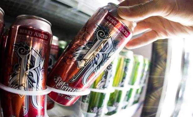
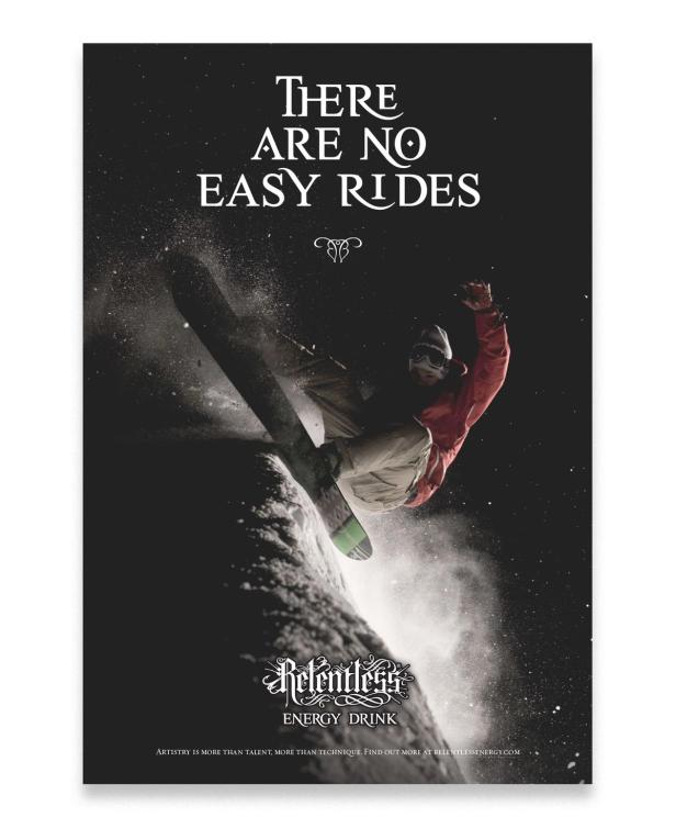
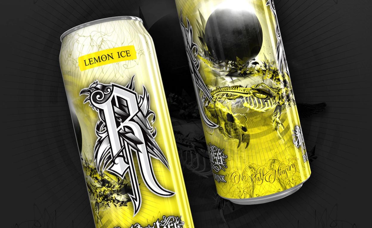
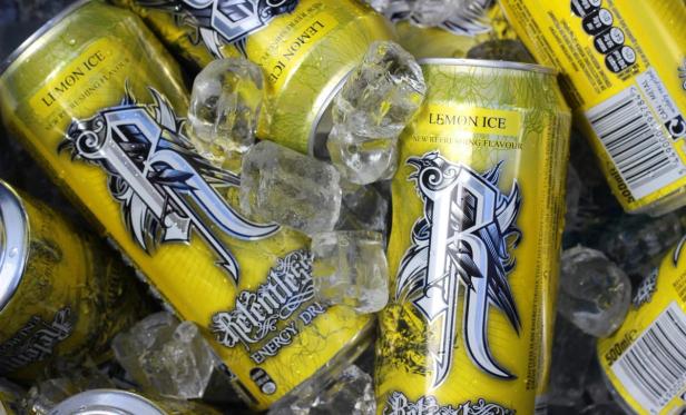
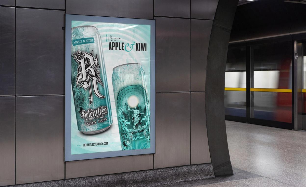
The visual of the cans dictated how the overall art direction of the entire identity looked in many areas. In previous years, the direction had been dark and niche. Although beautiful and energetic, research found that it alienated a potentially wide part of the market as it was misunderstood as alcoholic; flavouring options were vastly unclear; and it suffered from poor stand out on shelf. The updated designs we produced helped solve these issues and drive sales upwards.


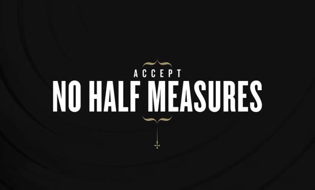
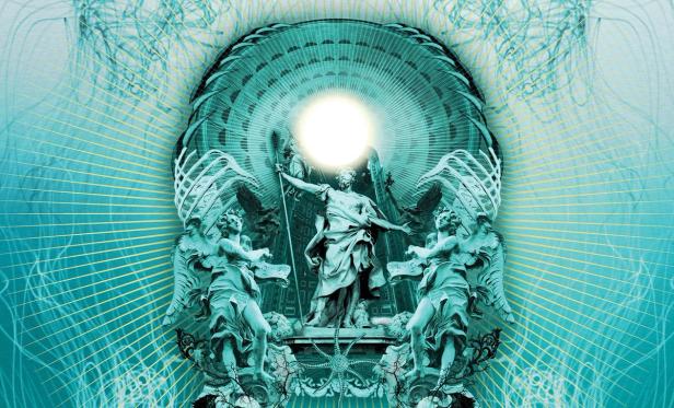
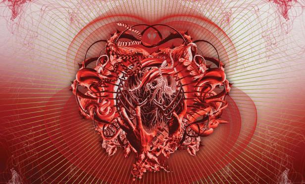
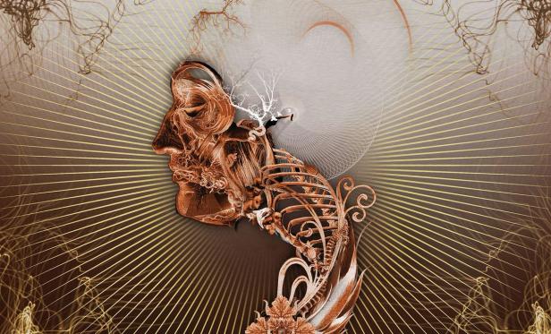
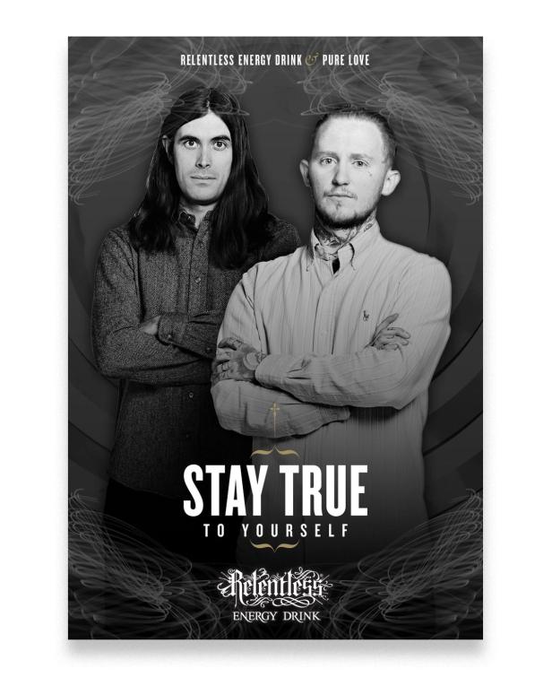
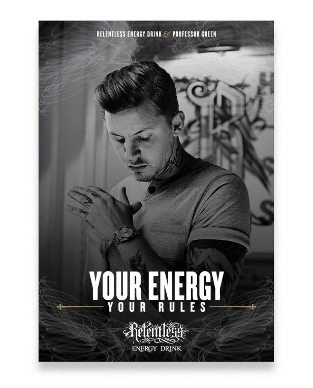
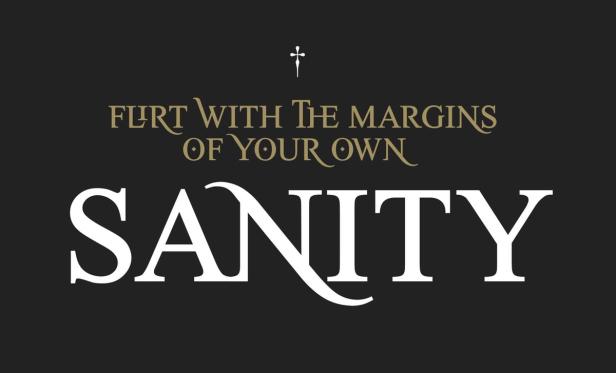
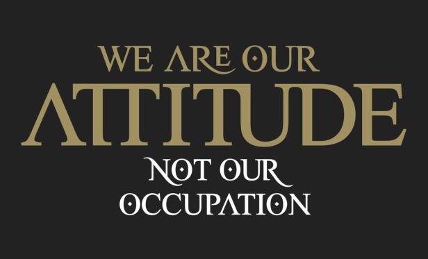
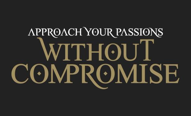
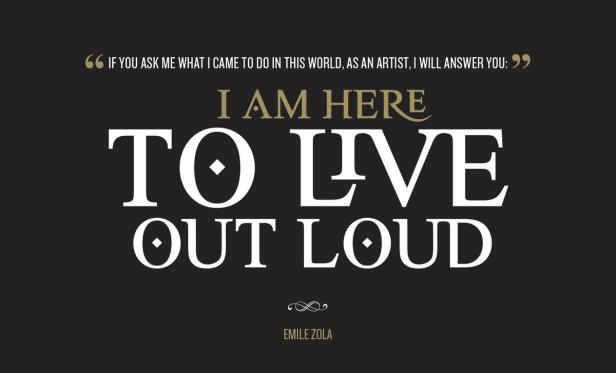
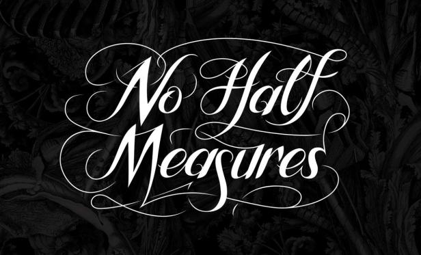
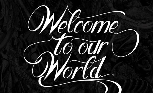
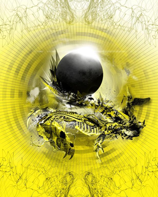
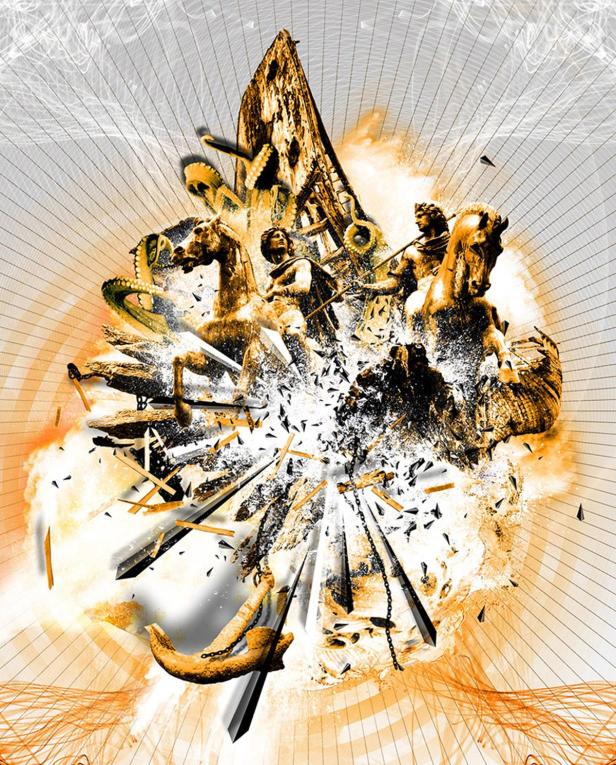
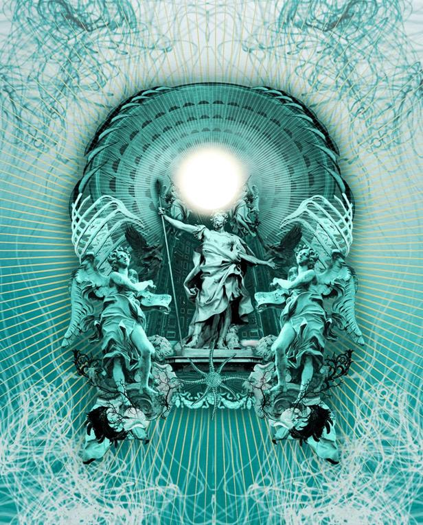
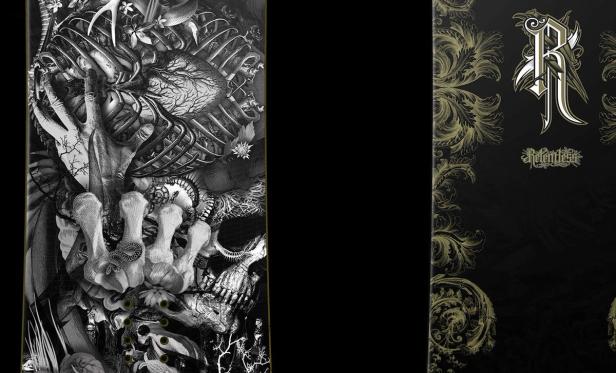
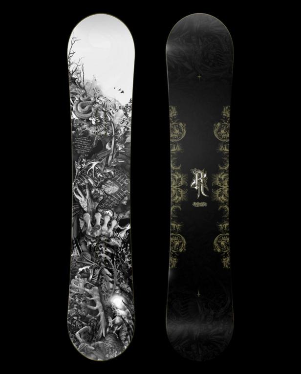
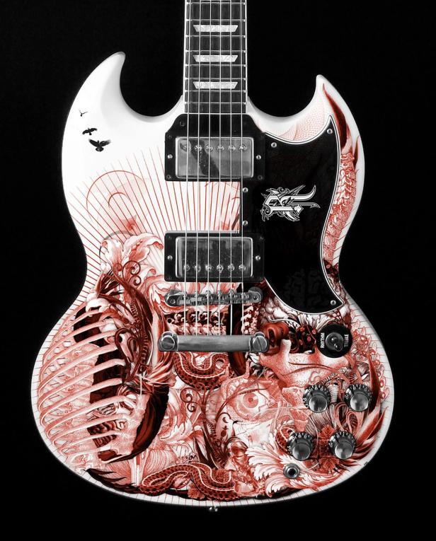
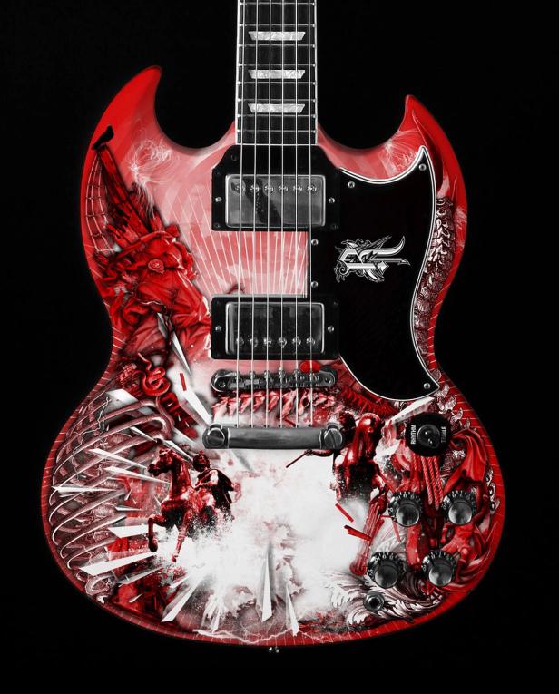
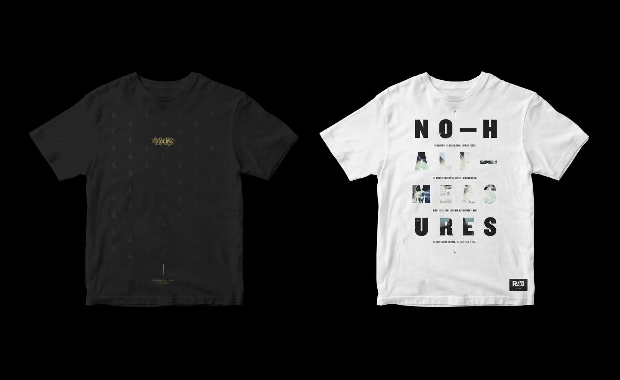
As a maximalist brand in an age of minimalists, detailed illustrations were devised to communicate the core message of the brand in a visual way—the inspirational complexity of the baroque period embodies the idea of the No Half Measures attitude. The marriage of this alongside modern elements carved out a unique visual positioning for the brand which communicated directly to an alternative audience.


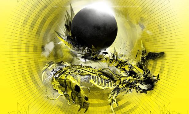

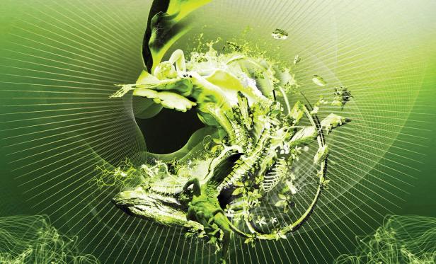

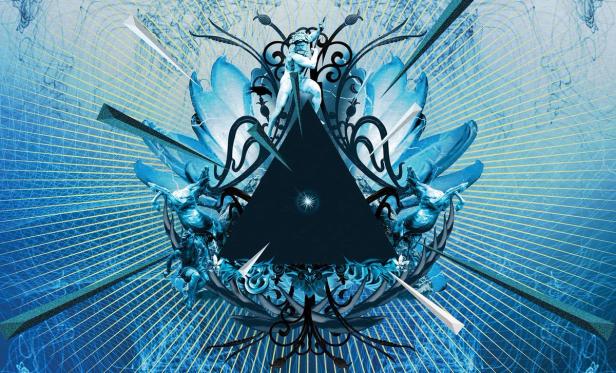


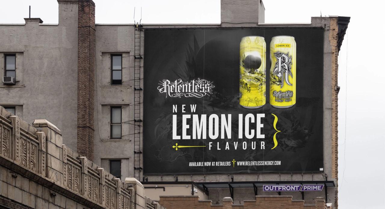
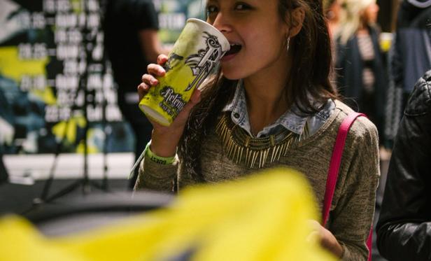
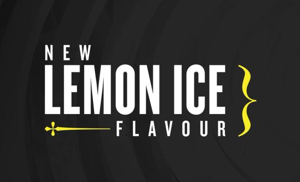
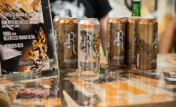
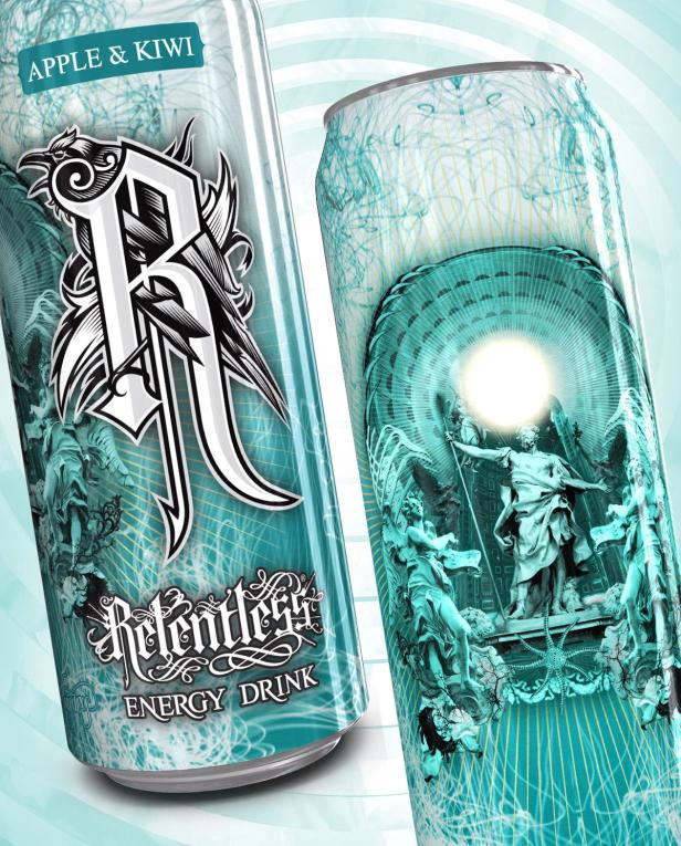
As the Relentless brand grew more popular, there was a desire to expand the product range with new flavours to keep up with some of the larger energy brands. This meant creating new illustrations based on the existing style we had re-worked from previous designs. I produced illustrations for 3 out of 5 second generation flavours: Lemon Ice, Mango Ultra and Apple & Kiwi.


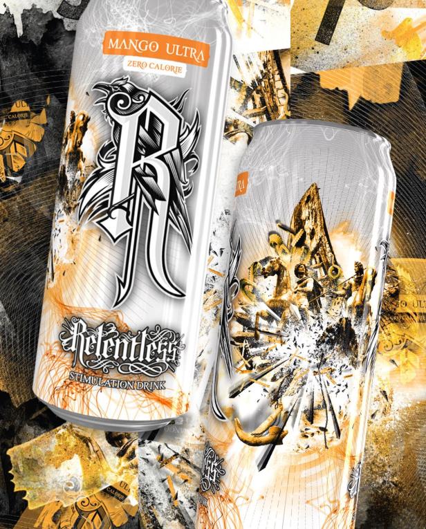

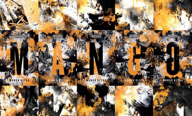


Mango Ultra was REDs first foray into flavoured sugar free energy drinks, after the ‘Origin Ultra’ flavour


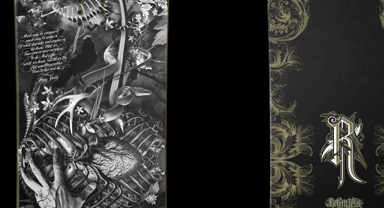
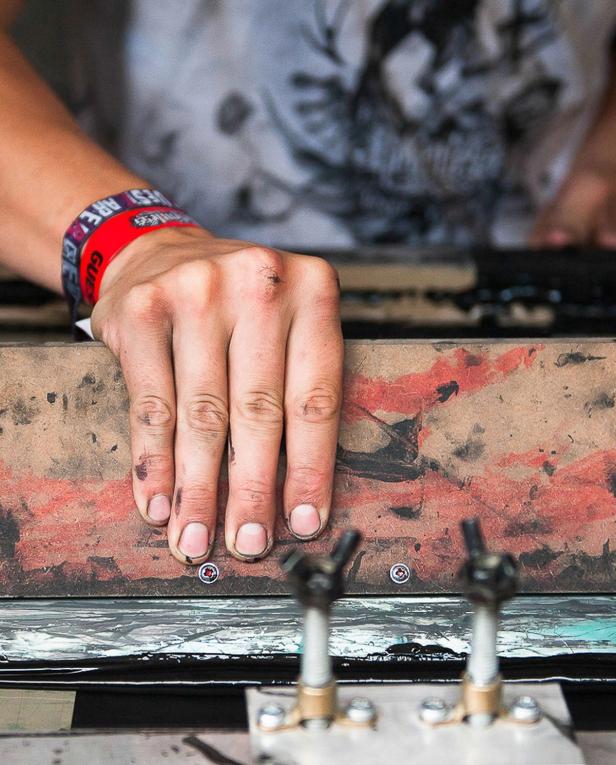
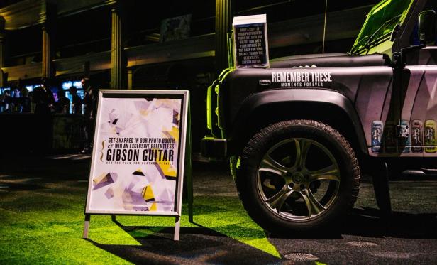
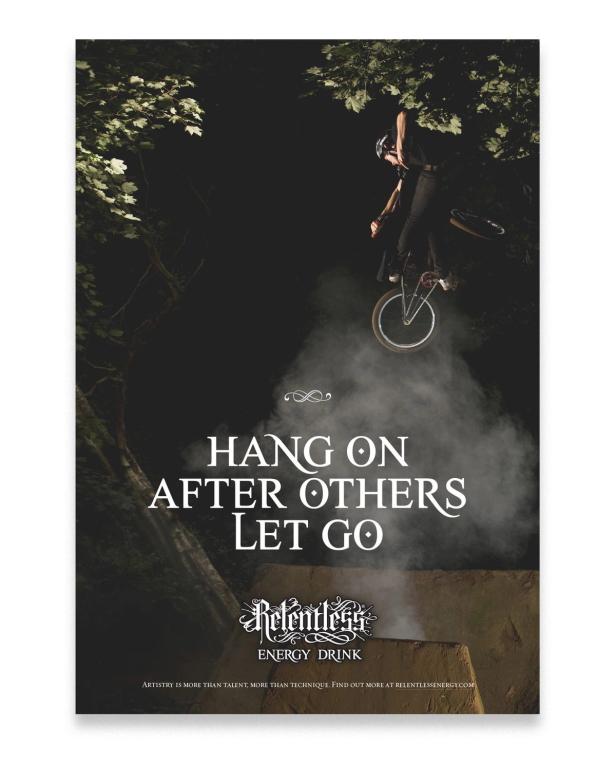
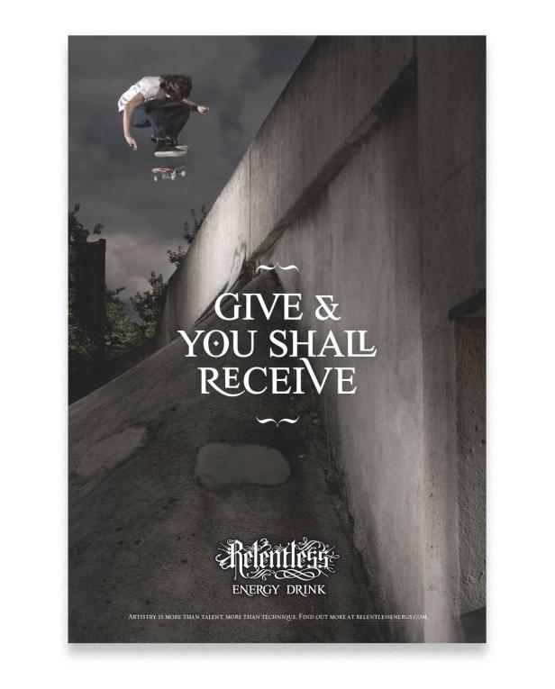
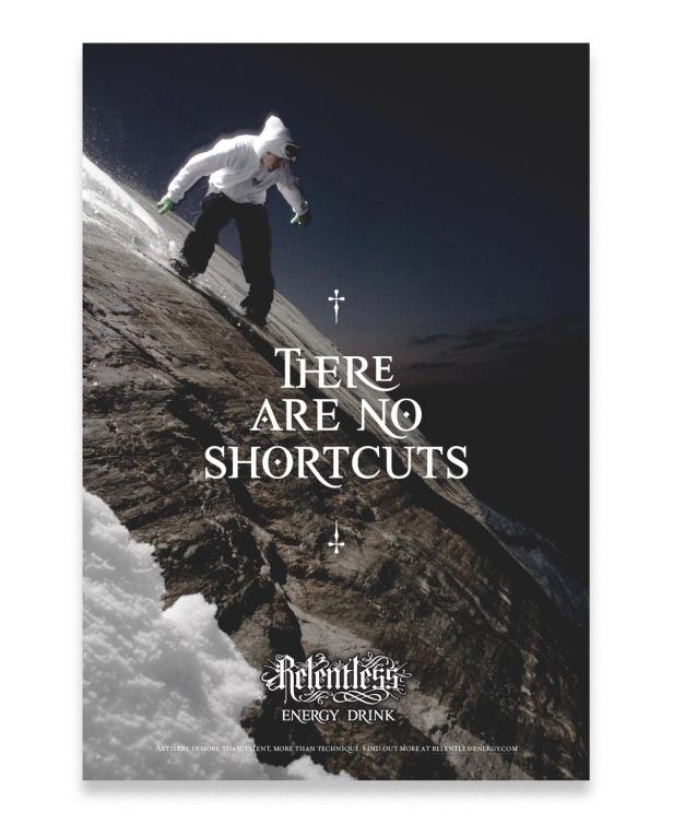
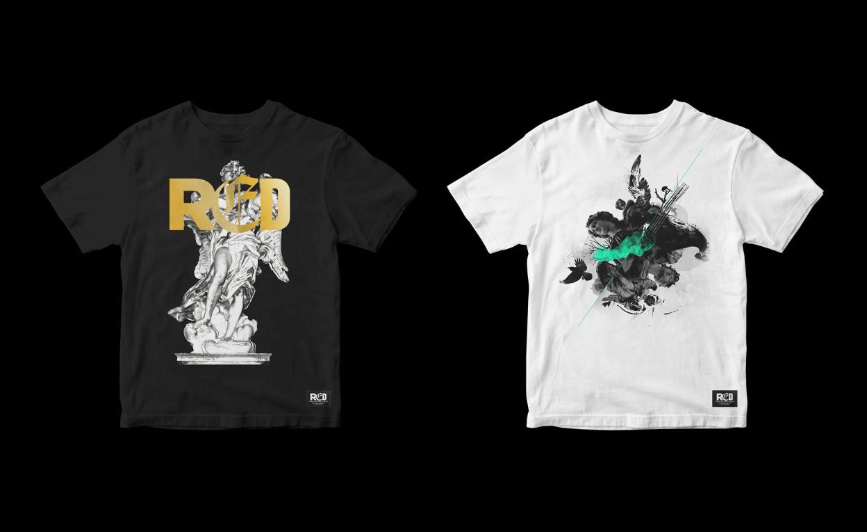
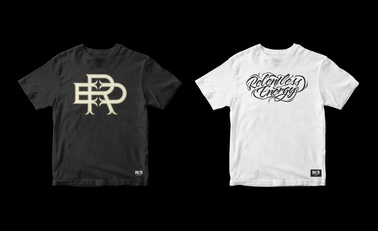
As RED actively participated in alternative music, sport and culture by sponsoring and supporting artists and athletes, producing equipment such as snowboards, merchandise and guitars was an ongoing project. This was a key area that the identity could flourish and the creative side knew no bounds—there was less stakeholder input as we were creating desirable things for a smaller sector of the market that wanted their stuff in a specific, non-corporate way.


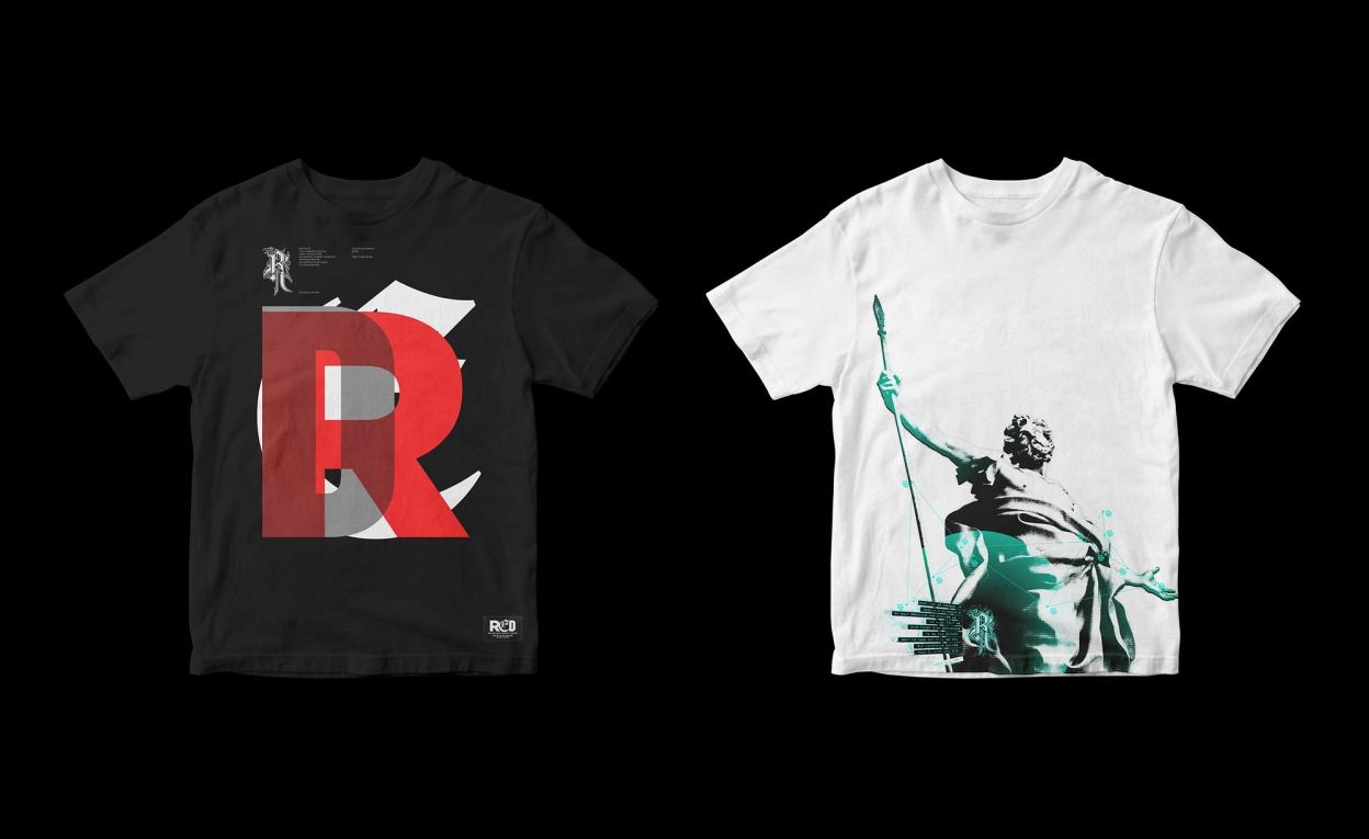


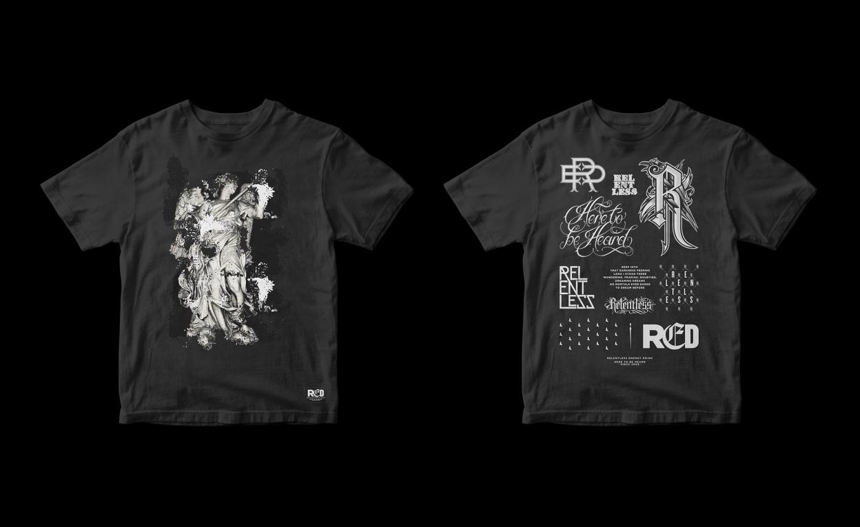


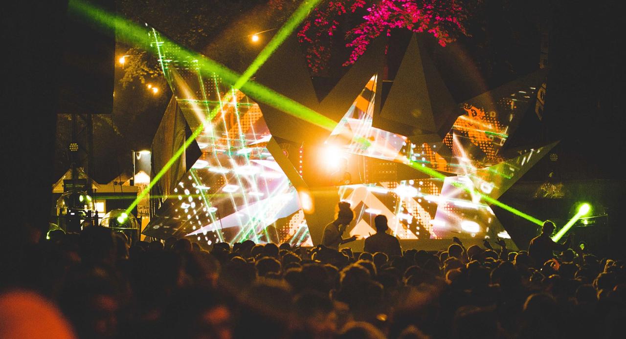
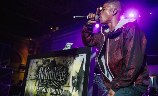
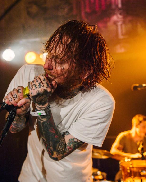
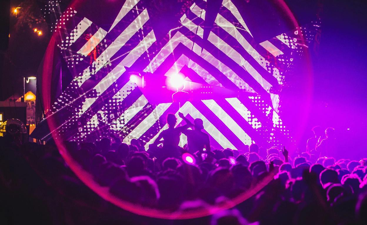
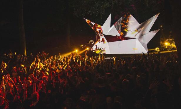
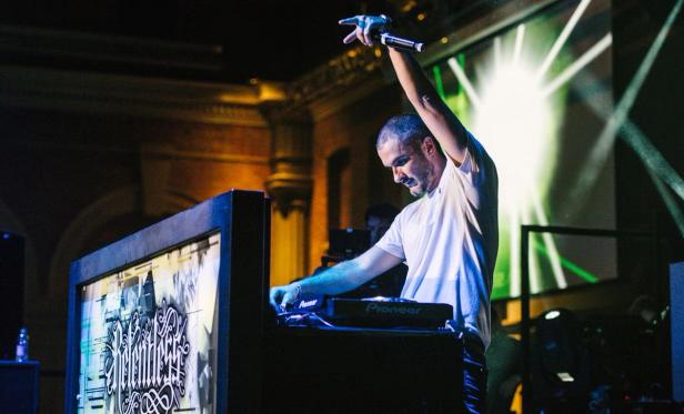
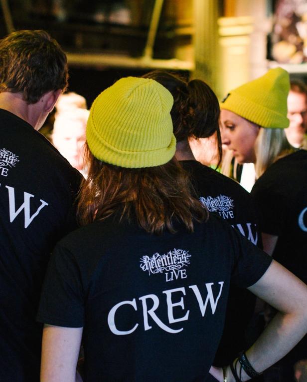
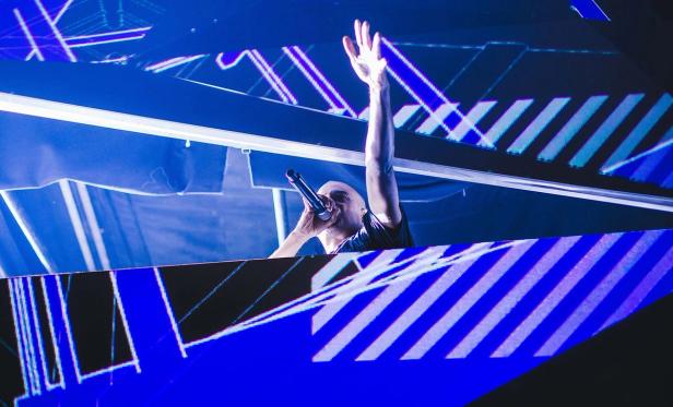
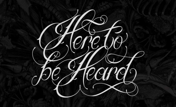
Relentless sponsored events such as Leeds & Reading Festival, the Kerrang! Awards and Boardmasters, whilst hosting their own events including Relentless Live and Here to be Heard. I led multiple design efforts for these events and directed designers to produce various promotions.